
Instant Case Study: visitnc.com, or a review of the color Orange.
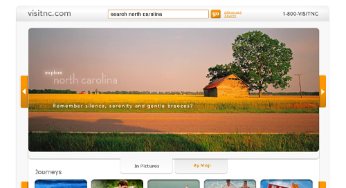
Check out our white space!
At the Travel 2.0 blog, Mo and I love new design. A chance to look at, review and imagine why certain choices were made is always a fantastic interactive marketing exercise. And, low and behold,our friends in North Carolinadecided it was time for an update.
For our loyal readers, you know the drill, read the comments and let us know what you think.
Read the our thoughts and then let us know what you think. (Email or RSS readers, can't see the poll?Visit the Travel 2.0 blog to vote.)
Thoughts//This site is a paradox. On one hand, I love the clean look, simple design and use of color...very Apple.com, but on the other hand, I can't help but think that we have lost the feeling, sense and emotion of North Carolina, even with the large image opening the homepage.
While the site looks to have undergone a major revamp at first glance, you can still see evidence of the previous occupant here and there...the 3 column layout, footer, etc. Even the large image at the top reflects a certain homage to the previous image background on the old site.
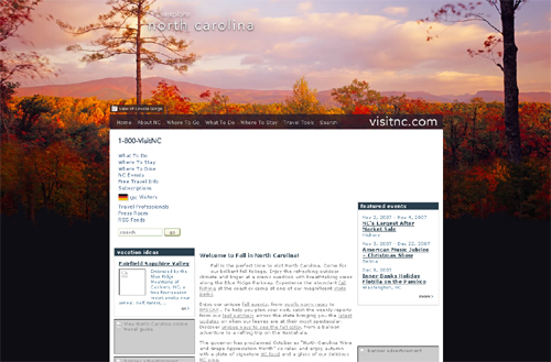
Does this feel more North Carolina ish to you?
As for the major additions to the homepage, I love the image search scroll bar thing. Interested to see what the response, via analytics, to that new feature. The top 5 list and calendar of events search are both nice additions and executions as well. And I really love the map feature on the homepage. Click the 'by map' tab below the large image. Although it is not a Google map, kudos for keeping the map simple and effective. The tag cloud feature (after you click on the magnifying glass) is another nice feature, although I am unsure if that option is explained thoroughly enough...and I wonder how those categories are scored.
The primary interior pages are driven by that image search scroll bar thing as the navigational element and contain a ton of info about each subject. The consolidation of content, video, images, etc. is a nice feature, however I am a little overwhelmed by the layout of the pages with so much content presented at one time.
Which ties into one of my dislikes about the new site, the 3 column layout at the bottom of each page. Not a bad design element, but with so much information presented in a list style, it is difficult to read quickly. Of course, part of that might be the primary call to action color for the website, the color orange.
Now, as you can plainly tell by the Travel 2.0 blog, we like the color orange as a link or focus color. But in this execution it feels overused. Because everything 'important' is orange, it becomes challenging to determine what is most important, kind of important and not that important. A hierarchy of information is critical to leading the eye to the locations within the site that are most important. Otherwise links, banners and buttons begin to cancel each other out.
Of course, that is just our initial thought. I am sure that North Carolina put some time into researching the correct colors for the site and determined there was just too much controversy using Carolina Blue for all the links.
So, what do you think? Clean and simple or boring and plain? The new visitnc.com, love it or hate it? Vote and let us know what you think about the site byusing the comments section.
More from the Travel 2.0 Blog
Why The Story Is More Important
Why you need an expert storyteller, not a social m...Making Social Media Marketing More Social
Is it time for a new approach to social media ...Case Study: Sonoma County iPhone App
About an year ago, PhocusWright correc...
blog comments powered by Disqus
I looked at it purely from a utilitarian function trying to find information about Burlington, which is near Greensboro. The map is a dead end. Navigating other home pages lead me nowhere.
So, I tried search. The results gave me lots of listings for Burlington area attractions but nothing very useful. But wait! Over on the left is a group of suggested links, the second of which begins "Burlington/Alamance County CVB" Eureka!
But not so fast. THREE clicks later, I am still not on the Burlington/Alamance County CVB website.
With search being literally front and center on the new homepage, it should work a lot better than this.
Hey Dave,
Great comments. I agree with your thoughts on the search feature. It appears that they are trying to use a custom search application that creates those 'suggestions.' However, the downside is that they are not using Google...at least, as far as I can tell.
I hate to simply throw up my arms and praise Google as the one and only site search answer...but frankly, it just works better.
And I agree about the map. It looks great and I love the idea, but not helpful for a map based search.
Troy
We had a discussion in our agency about the new visitnc.com site. While the homepage still displays some photography (which is amazing), the interior pages suffer from a lack of strong imagery.
Our Creative Director mentioned the layout is nice and clean "But I did find myself wondering "Now what am I suppose to do?" "
I find the use of "thumbs up/thumbs down" interesting. Literally every article or content element has this, however it's implementation is off. The number in parentheses is the total number of votes. So you may have a (24) and you need need to hover over the "up" to see there is 14 votes and "down" to see 10 votes. Personally I would show only the net result in parentheses (+4) AND only show this element to rate attractions, destinations packages etc. versus rating the content of the site.
The online directory is outstanding IMHO. I love the integration of interactive maps (gmap) and tags. The directory listings are actually useful especially when compared to other state tourism sites.
Personally I feel the navigation philosophy is "high concept" which means there is going to be a higher percentage of visitors who just don't get it.
I commend visitnc for really pushing the envelope. This makes some state tourism websites look darn right ancient. I think some serious usability testing would help iron out the navigation issues.
Jack
Why Travel 2.0 Instant Case Study: visitnc.com, or a review of the color Orange.