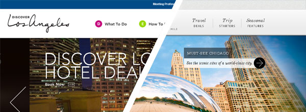
3 Strategic Website Lessons from Los Angeles and Illinois

Recent website updates to and have drawn alike.
Beyond the modern look and clean feel of both digital properties, a massive amount of thinking, research and consideration went into the overall user-interface (UI) and user-experience (UX).
It was not simply a case of make it look pretty.
We had the privilege of providing our tourism consulting expertise on both the LA and Illinois web development projects and wanted to share 3 strategic website lessons that you can apply to your DMO, CVB or NTO site.
Also, a note of recognition for the hard work from both the LA and Illinois teams, and their respective agencies. While we assisted with strategic recommendations, the execution was carried out by some very talented individuals.
1. Thoughtful Social Integration
You might notice…or not notice…the social media integration on both sites. Unlike many tourism organization websites, LA and Illinois resisted the temptation to surrender large portions of the homepage (or any page) to social widgets.

Social icons are limited to the footer (Illinois) and floating footer (LA) on both sites.
Rather than simply slapping a ShareThis widget on every page, both sites carefully place and at key locations on the website.
Integrating social activity is an important way to introduce new content and build a social audience, but it should not be included at the expense of conversion.
Your customers are never closer to a successful conversion…the moment of travel…than when they are on your website.
Don’t distract them with poorly placed social integration.
2. Invest in Great Photos

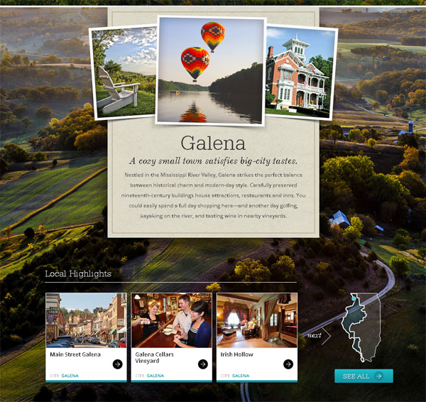
I have no idea what is in Galena, but I want to go there.
Simply because of that photo.
For both LA and Illinois, a special emphasis was placed on photography. And not just average photography, great photography. Photography that makes you say ‘I did not know it looked like that.’
As consumers increasingly interact with your digital properties through bigger and better screens, poor photography becomes exponentially worse…harmful to your destination’s image.
Dedicate 5%, 10% or even 15% of your web development budget to photography.
It’s an investment that you will see pay off everyday.
3. The Importance of Maps

Often overlooked and commonly underused, maps play an intricate role on both discoverlosangeles.com and enjoyillinois.com.
For LA, the problem was scale and education. Greater Los Angeles is built from which cover such a vast area even locals have a tough time telling them apart.
Let alone visitors.
The solution was literally a giant map, large enough to represent the scale of LA and to grab the attention of the passing website visitor. For LA, educating the consumer about neighborhoods is a critical step to moving through the rest of the site.
Illinois faced a different, yet common problem for state destination marketing organizations: ambiguously named regions.
Aside from Chicago & Beyond, the regions that make up Illinois are difficult for the visitor to identify.
Land of Lincoln.
Trails to Adventure.
Great Rivers Country.
Yeah, the Mississippi River is the western border of Illinois.
Confusing, yes?
The solution was educating the consumer about the regional names by connecting them with the major cities within the region through clearly defined and repetitive maps.
Throughout the site…navigation, and …maps provide a continuous point of reference for the potential visitor.
Because even the locals need help finding Makanda.
3 Strategic Website Lessons
Perhaps your DMO or NTO does not have the resources of Illinois or the budget of Los Angeles, but that should not prevent you from implementing helpful and simple website lessons from these recently updated sites.
Careful social integration, great photography and the thoughtful use of maps.
3 strategic website lessons that will help improve your DMO’s website.
 |
Receive New Articles via Email
|


