Why Your Responsive Design Depends on Content

“Must have Responsive Design dimensions.”
Yes, the line above is straight from a recent web development RFP on behalf of a fairly major CVB. A requirement that has joined the list of often requested, yet rarely understood digital demands such as ‘social integration’, ‘mobile friendly’ and ‘SEOed.’
Yeah, ‘SEOed.’
Pure Responsive Design
Recently, our peers at update, with a particular highlight: responsive design.
First things first. The new is certainly an improvement over the previous version…a nice UI, decent content and a site that (one would assume) addresses the needs and goals of Pure Michigan.
But that line about responsive design bugged me.
I know that many of our peers are looking toward responsive design as the panacea for their mobile dilemma, while our agency friends are more than happy to expand current contracts to include this new-found web solution. Add the influence of Pure Michigan on her peers (kudos George and team) and you have what seems to be a glowing endorsement of responsive design for every DMO, CVB and NTO.
But is it necessary?
Is it helpful for the traveling consumer?
Is it just a gimmick?
What is Responsive Design?
So, this article is already too nerdy for you, huh? Well, nice work getting this far. If you need a quick Responsive 101, I would recommend starting here:
The Issue with Michigan.org
The design is responsive, but the content is not.
 Scale the website in your browser…the site just stacks, gets longer and lists everything. Including that damn social bar.
Okay, technically, it does not list everything. The Michigan map graphic, hero image caption and the (actually useful) footer link section all disappear. Which tells me that the developers know how to reduce and remove with responsive, but have chose not to.
Why does this matter?
Because for all the talk…at conferences, in RFPs, among peers…about embracing and leveraging mobile, here we have an example of a prominent DMO forcing a desktop design into a mobile environment. Which creates a poor user experience and a poor example for our peers.
The train to Utrecht
 Let’s look at Christiaan Lustig’s oh-so relevant example to understand why responsive design is a challenge for tourism organizations:
I’m planning to travel to a nearby major city: in this case, The Hague, in the Netherlands. This requires me to travel by bus to the nearest train station, in Hilversum, then by train to Utrecht, and from there onwards to The Hague.
The evening before my trip, I carefully plan the journey, on my desktop computer at home, on the Dutch public transport site 9292.nl, which is very much focused on the top task: planning a trip from A to B at any given date and time.
All goes well with the bus to Hilversum. However, once on the platform, waiting for my train to Utrecht, the announcer states that my train is delayed by some 10 minutes. This means trouble, since I’m dependent on its timely arrival in Utrecht for my connection to The Hague. What to do?
Like its desktop counterpart, the mobile version of 9292.nl – although it has been redesigned quite recently, the site is not (yet) responsive – is focused on planning trips from A to B. But I’m on the platform, in the middle of my journey, and I need to find out whether my Hilversum-Utrecht delay will impact my Utrecht-The Hague connection.
That sounds like a different situation: a different location, a different task. That’s a different context, isn’t it?
Content v. Creative
The difference between what Pure Michigan has built and Christiaan’s example is context.
And context equals content.
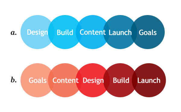
We can surmise that Pure Michigan, like many of her DMO brethren, built their digital strategy with design first, and content second.
When goals and content should come first.

Based on pure anecdotal evidence, I would venture that 90% of tourism organizations follow strategy a. when developing a digital plan, instead of strategy b.
Which is the error highlighted by responsive design.
A focus on design, rather than context and content.
Now, if the tasks and goals of your primary website are the same on a tablet or mobile device, then yes, responsive design is an excellent solution to the challenges of modern digital design.
But, if the goals of your primary website are not the same as the goals of your tablet solution or your mobile solution, then responsive design is nothing more than a cheap trick, diverting your attention from the true purpose of those mediums.
This is the challenge for tourism destinations.
Is the content developed for the core website coherent, structured and relevant for interactions beyond the laptop?
Have you established key goals for users across all mediums?
The issue is not responsive design, but responsible strategy.
Kudos + Content
Credit where credit is due. We are critical of the Pure Michigan responsive solution, but respect the attempt to break new ground for our industry. The site will be updated, modified and tweaked…including the responsive mobile site. However it is important to understand the pros and cons of the submitted solution.
Responsive design is a subject that you will encounter during your next web development project, but the conversation is bigger than just responsive v. optimized.
You need to shift your overall digital focus from design to content.
From pixels to people.
From wireframes to why.
Before you adopt a solution based upon peer execution, you have to develop a strategic blueprint based upon goals, tasks and content. Rather than buzzwords and bullshit.
Simply adding responsive design as a RFP requirement will not ensure mobile success. Responsive design is not an add-on, but a challenge to develop a comprehensive content strategy.
Start with the content.
Then worry about the creative.
-
Evan Tipton
-
/ Troy Thompson
-
http://www.LinkedIn.com/in/wiebesick Chad Wiebesick
-
http://twitter.com/swartsr Ryan Swarts
-
/ Troy Thompson
-
http://www.LinkedIn.com/in/wiebesick Chad Wiebesick
-
/ Troy Thompson
-
http://twitter.com/swartsr Ryan Swarts
-
/ Troy Thompson
